LAZERPAY
LAZERPAY
LAZERPAY
Revamping the Crypto Checkout Experience on Lazerpay Finance
Revamping the Crypto Checkout Experience on Lazerpay Finance
Revamping the Crypto Checkout Experience on Lazerpay Finance
My role
My role
User Researcher, UX Designer, UI Designer
User Researcher
UX Designer
UI Designer
User Researcher, UX Designer, UI Designer
Deliverables
Deliverables
UX Research, Design System, Product Design
UX Research
Design System
Product Design
UX Research, Design System, Product Design
Year
Year
2023
2023
2023


Project overview
Project overview
Moving away from the first version of Lazerpay’s checkout which catered for payment via crypto transfer only, and moving to version 2 - the redesigned checkout, enabling users pay via multiple payment methods such as crypto transfer, crypto wallet and crypto exchange.
Moving away from the first version of Lazerpay’s checkout, which catered for payment via crypto transfer only, and moving to version 2 - the redesigned checkout, enabling users to pay via multiple payment methods such as crypto transfer, crypto wallet and crypto exchange.
Moving away from the first version of Lazerpay’s checkout, which catered for payment via crypto transfer only, and moving to version 2 - the redesigned checkout, enabling users to pay via multiple payment methods such as crypto transfer, crypto wallet and crypto exchange.
Discover and Define
Discover and Define
I used the double diamond framework to design a reimagined experience for Lazerpay’s checkout. Before diving into Figma, I aimed to understand user pain points that also aligned with business objectives. Research findings from anonymised conversations, customer support requests, and user sessions concerning the current checkout and business requests revealed various use cases to address, with users seeking more payment options while ensuring the safety of their funds.
I used the double diamond framework to design a reimagined experience for Lazerpay’s checkout. Before diving into Figma, I aimed to understand user pain points that also aligned with business objectives. Research findings from anonymised conversations, customer support requests, and user sessions concerning the current checkout and business requests revealed various use cases to address, with users seeking more payment options while ensuring the safety of their funds.
I used the double diamond framework to design a reimagined experience for Lazerpay’s checkout. Before diving into Figma, I aimed to understand user pain points that also aligned with business objectives. Research findings from anonymised conversations, customer support requests, and user sessions concerning the current checkout and business requests revealed various use cases to address, with users seeking more payment options while ensuring the
safety of their funds.
The recurring user pain points include a confusing and inconsistent layout, as the previous checkout modal was confusing and lacked a clear call to action. Users also disliked the lack of flexibility in making payments and felt restricted by the default options. These issues led to abandoned transactions and users opting for competitor products as a result.
The recurring user pain points include a confusing and inconsistent layout, as the previous checkout modal was confusing and lacked a clear call to action. Users also disliked the lack of flexibility in making payments and felt restricted by the default options. These issues led to abandoned transactions and users opting for competitor products as a result.
The recurring user pain points include a confusing and inconsistent layout, as the previous checkout modal was confusing and lacked a clear call to action. Users also disliked the lack of flexibility in making payments and felt restricted by the default options. These issues led to abandoned transactions and users opting for competitor products as a result.

Confusing and inconsistent layout
Rigid payment option
Bad UX
Abandoned transactions
Confusing and inconsistent layout
Rigid payment option
Bad UX
Abandoned transactions
Confusing and inconsistent layout
Rigid payment option
Bad UX
Abandoned transactions
The million-dollar question
The million-dollar question
How can I design a solution that would cater to different crypto payment methods, and allow users to seamlessly make payments in one place without having to switch wallets?
How can I design a solution that would cater to different crypto payment methods, and allow users to seamlessly make payments in one place without having to switch wallets?
How can I design a solution that would cater to different crypto payment methods, and allow users to seamlessly make payments in one place without having to switch wallets?
OPTION A
OPTION B
OPTION A
OPTION B
OPTION A
OPTION B

What we had before
What we had before


What we had before
What we had before
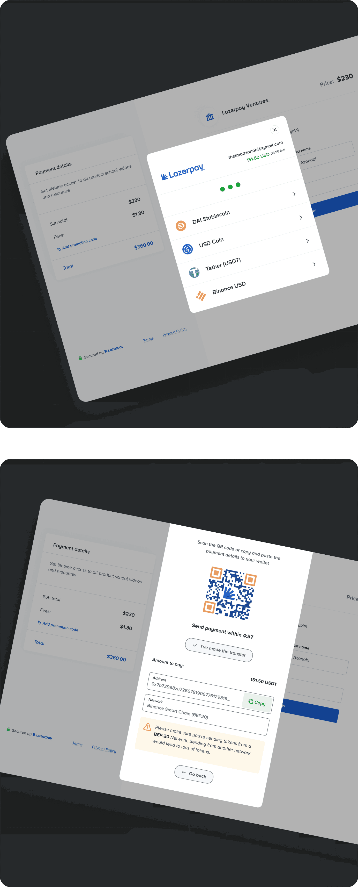
Out with the old, in with the new
Out with the old, in with the new
Lazerpayfinance - Dashboard
lazerpayfinance.com/dashboard/checkout
Lazerpayfinance - Dashboard
lazerpayfinance.com/dashboard/checkout
Lazerpayfinance - Dashboard
lazerpayfinance.com/dashboard/checkout
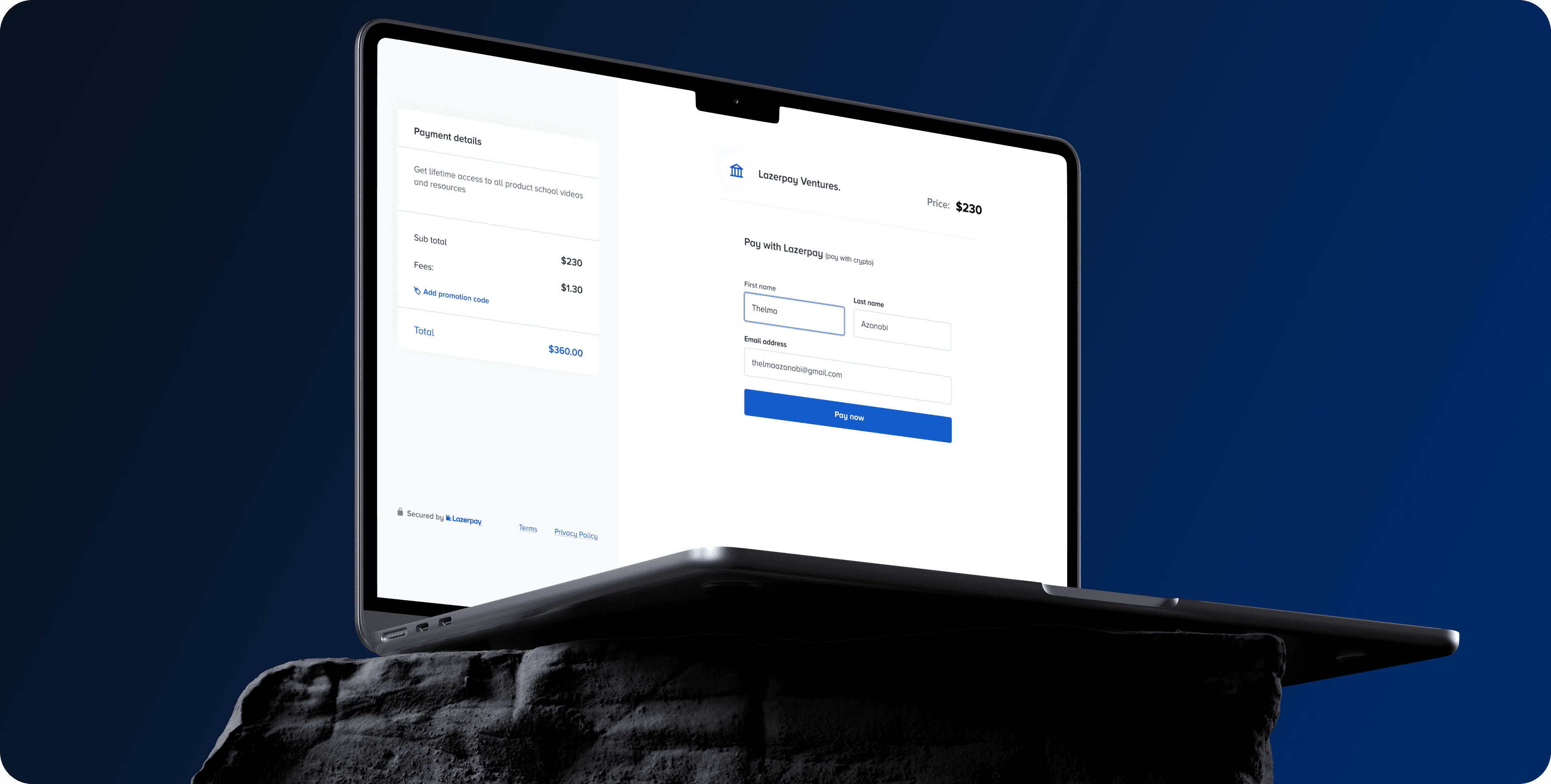
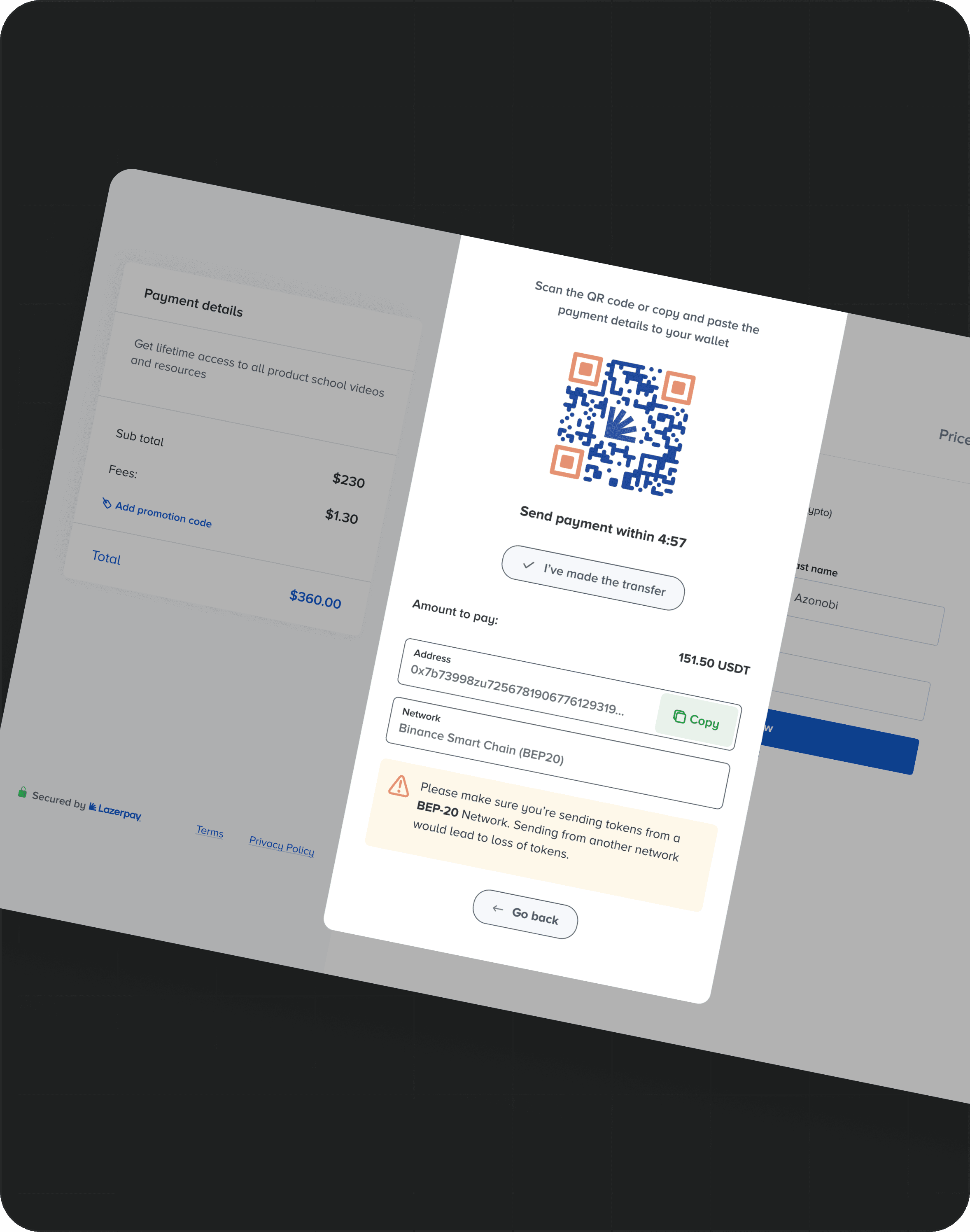
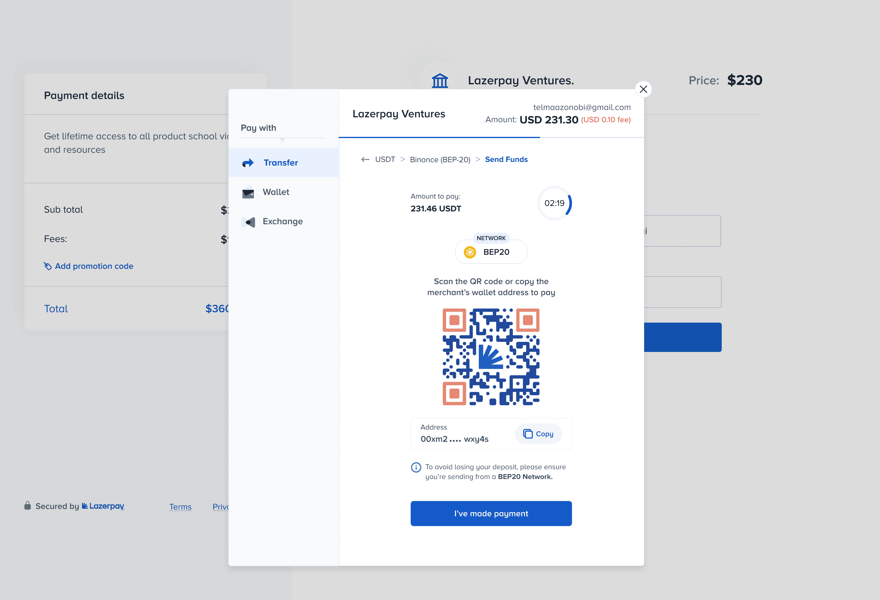
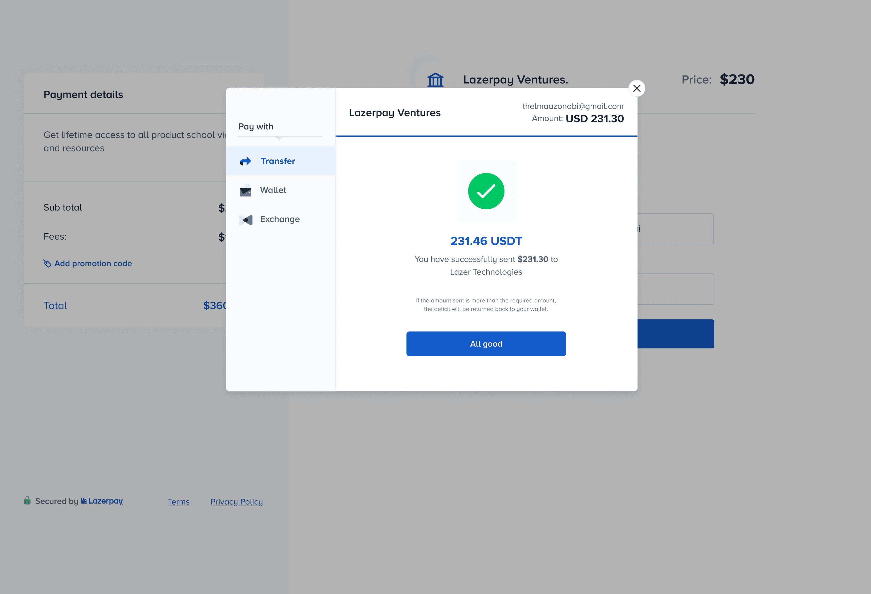
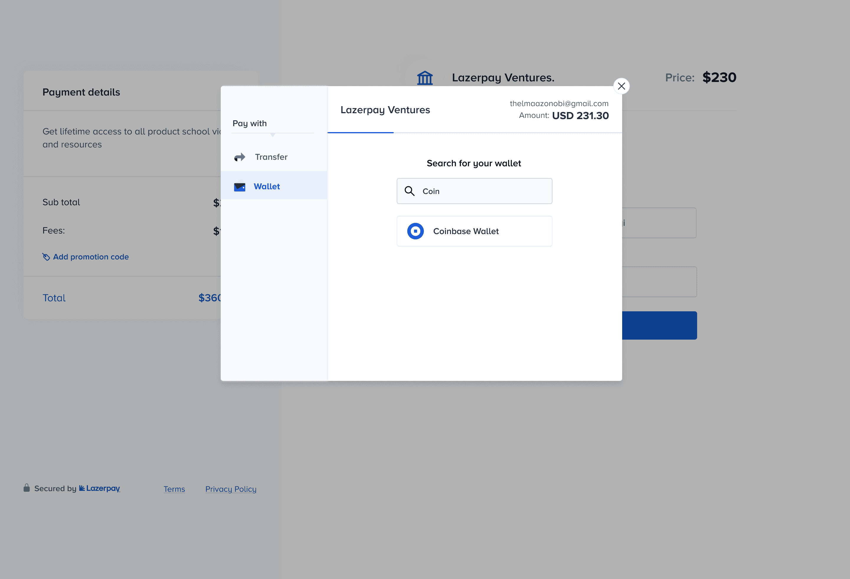
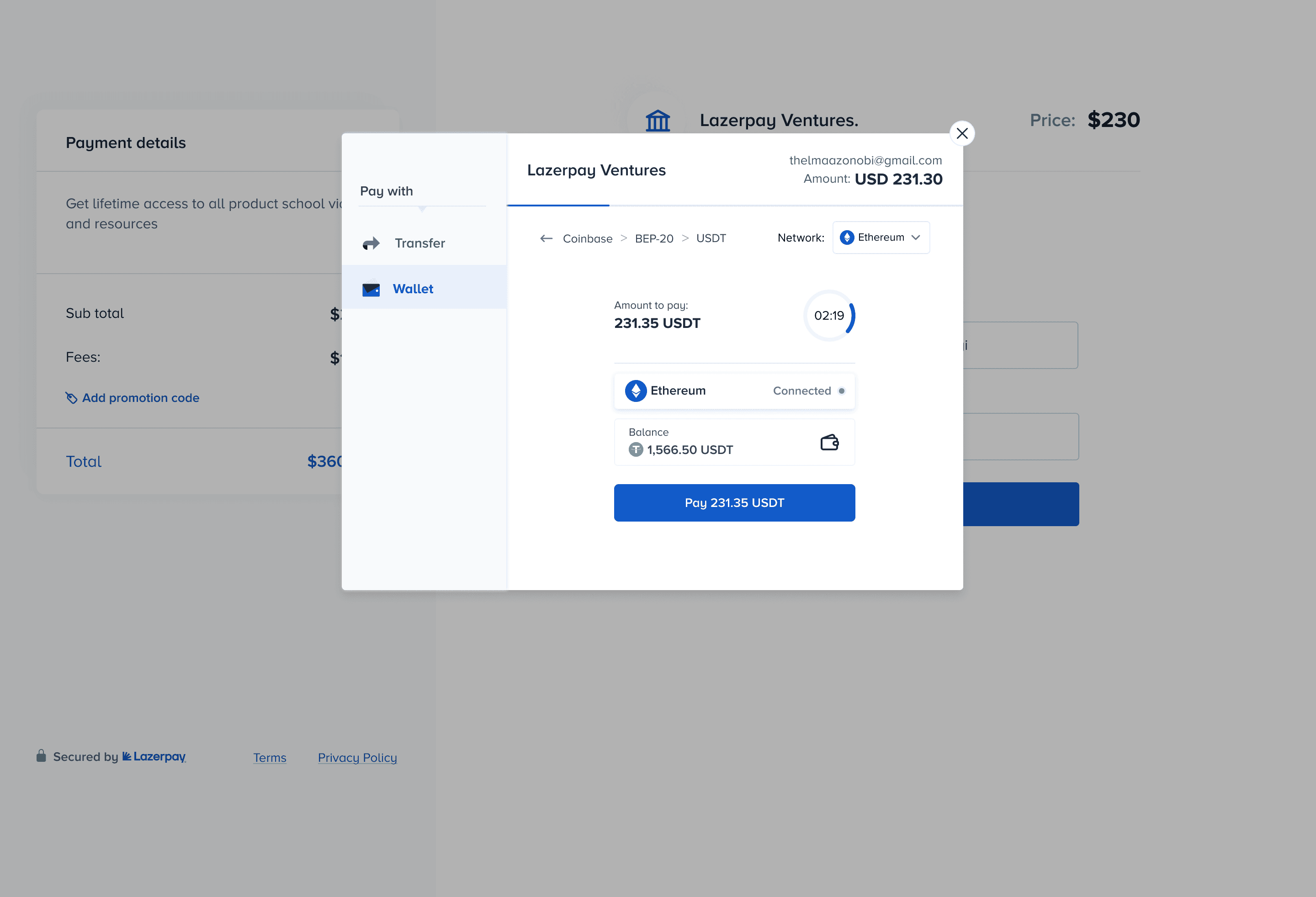
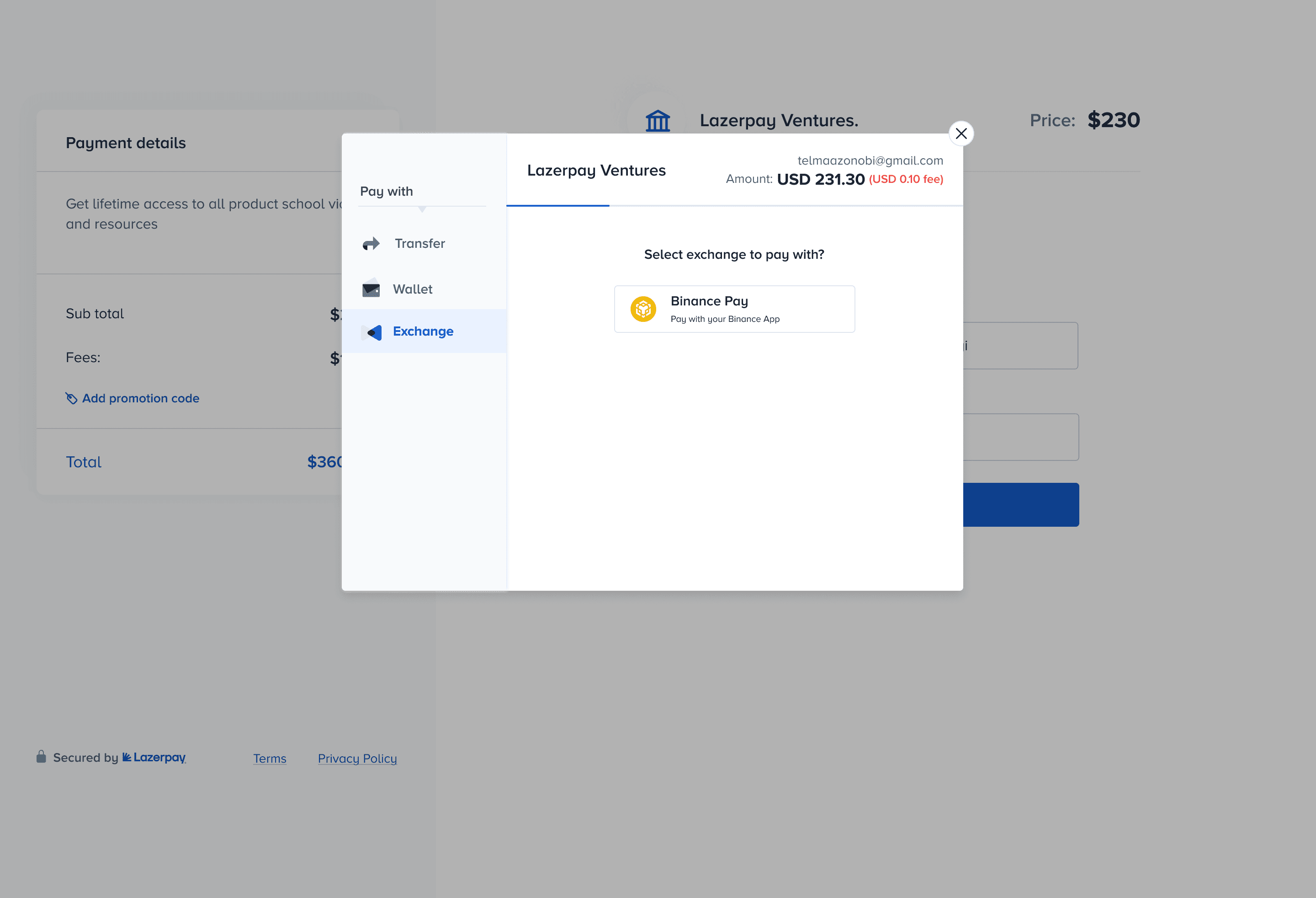
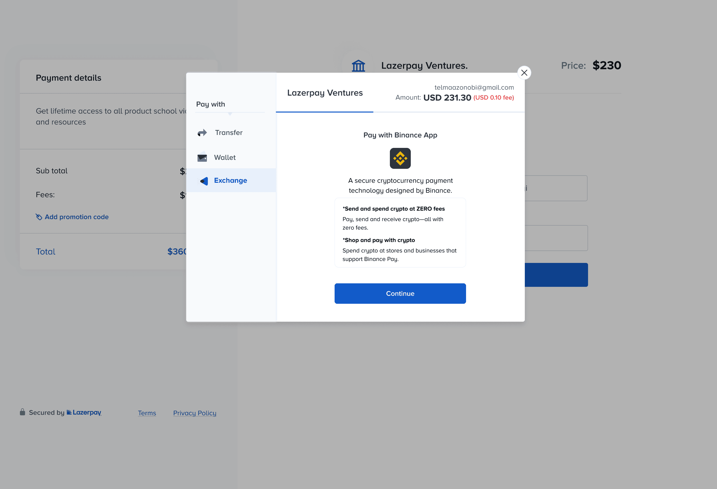
The previous designs seemed cluttered and had an inconsistent layout, with two unclear CTA (call to action) buttons that lacked sufficient context. The design above and below resolved this issue and also incorporated several payment methods: Crypto Transfer, DeFi Wallet payment, and payment via Crypto Exchange.
The previous designs seemed cluttered and had an inconsistent layout, with two unclear CTA (call to action) buttons that lacked sufficient context. The designs above and below resolved this issue and also incorporated several payment methods: Crypto Transfer, DeFi Wallet payment, and payment via Crypto Exchange.
The previous designs seemed cluttered and had an inconsistent layout, with two unclear CTA (call to action) buttons that lacked sufficient context. The designs above and below resolved this issue and also incorporated several payment methods: Crypto Transfer, DeFi Wallet payment, and payment via Crypto Exchange.
User Interface
Crypto transfer
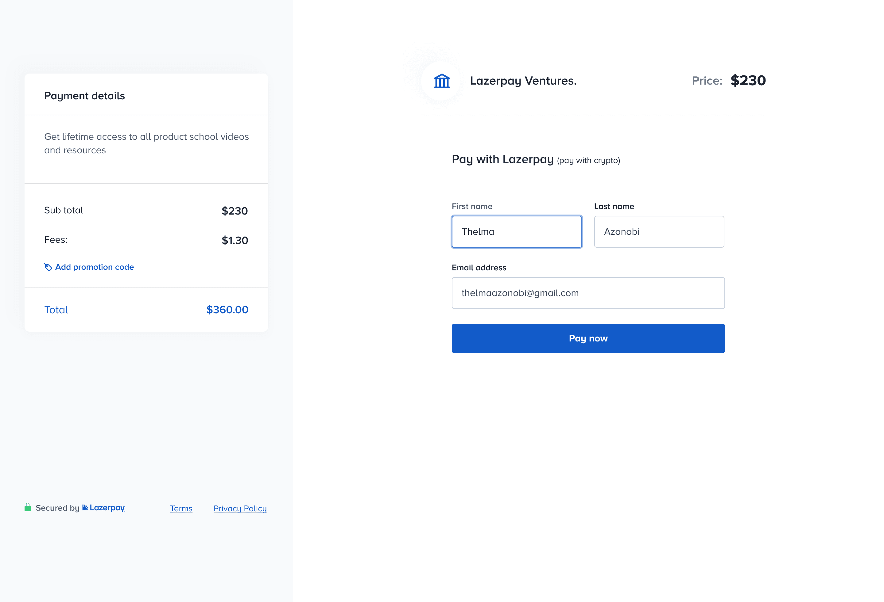

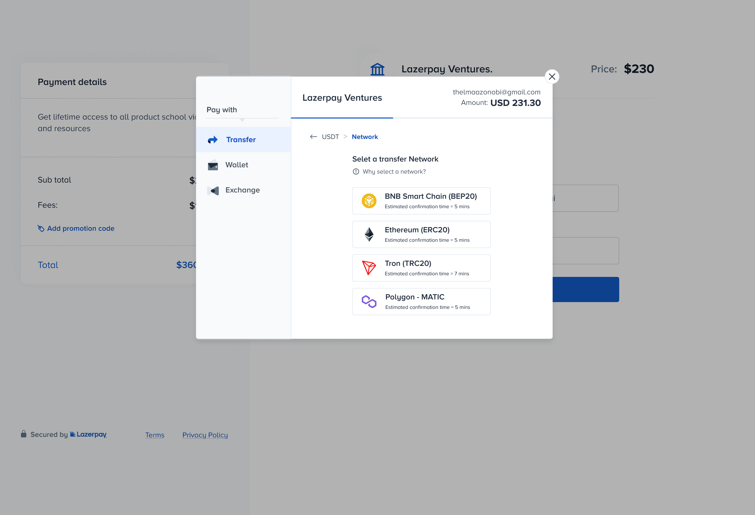


User Interface
Defi-wallet


User Interface
Exchange


User Interface
Crypto transfer
User Interface
Defi-wallet
User Interface
Exchange
User Interface
Crypto transfer
User Interface
Defi-wallet
User Interface
Exchange
Results
Results
We witnessed exponential growth due to the redesigned checkout experience, which has been used by 600+ merchants and businesses to successfully receive crypto payments from their customers.
We witnessed exponential growth due to the redesigned checkout experience, which has been used by 600+ merchants and businesses to successfully receive crypto payments from their customers.
We witnessed exponential growth due to the redesigned checkout experience, which has been used by 600+ merchants and businesses to successfully receive crypto payments from their customers.
55%
55%
55%
increase in the number of successful crypto transactions.
20%
20%
20%
increase in merchant’s LTV within 90 days.


SEND AN EMAIL👇🏾
thelmaazonobi23@gmail.com
Digital product designer
Based in the UK 🇬🇧
LET'S CONNECT
DESIGNED BY THELMA WITH. 💜
SEND AN EMAIL 👇🏾
thelmaazonobi23@gmail.com
Digital product designer
Based in the UK 🇬🇧
DESIGNED BY THELMA WITH. 💜
SEND AN EMAIL 👇🏾
thelmaazonobi23@gmail.com
Digital product designer
Based in the UK 🇬🇧
DESIGNED BY THELMA WITH. 💜